Empowering entrepreneurs fueling growth knowledge
TLDR
- Getting traffic but no sales is almost never a traffic problem, it is a conversion, clarity, or trust problem.
- Most sites attract curious clickers, not buyers, because ads and landing pages are misaligned.
- Cognitive overload on mobile quietly kills conversions, especially for premium offers.
- Trust signals, social proof, and decision support matter more than discounts.
- Fewer choices, clearer positioning, and better intent targeting almost always lift conversions fast.
- Fix the website first, then optimize ads, not the other way around.
Why Your Website Gets Traffic But No Sales (And How to Fix It for Good)
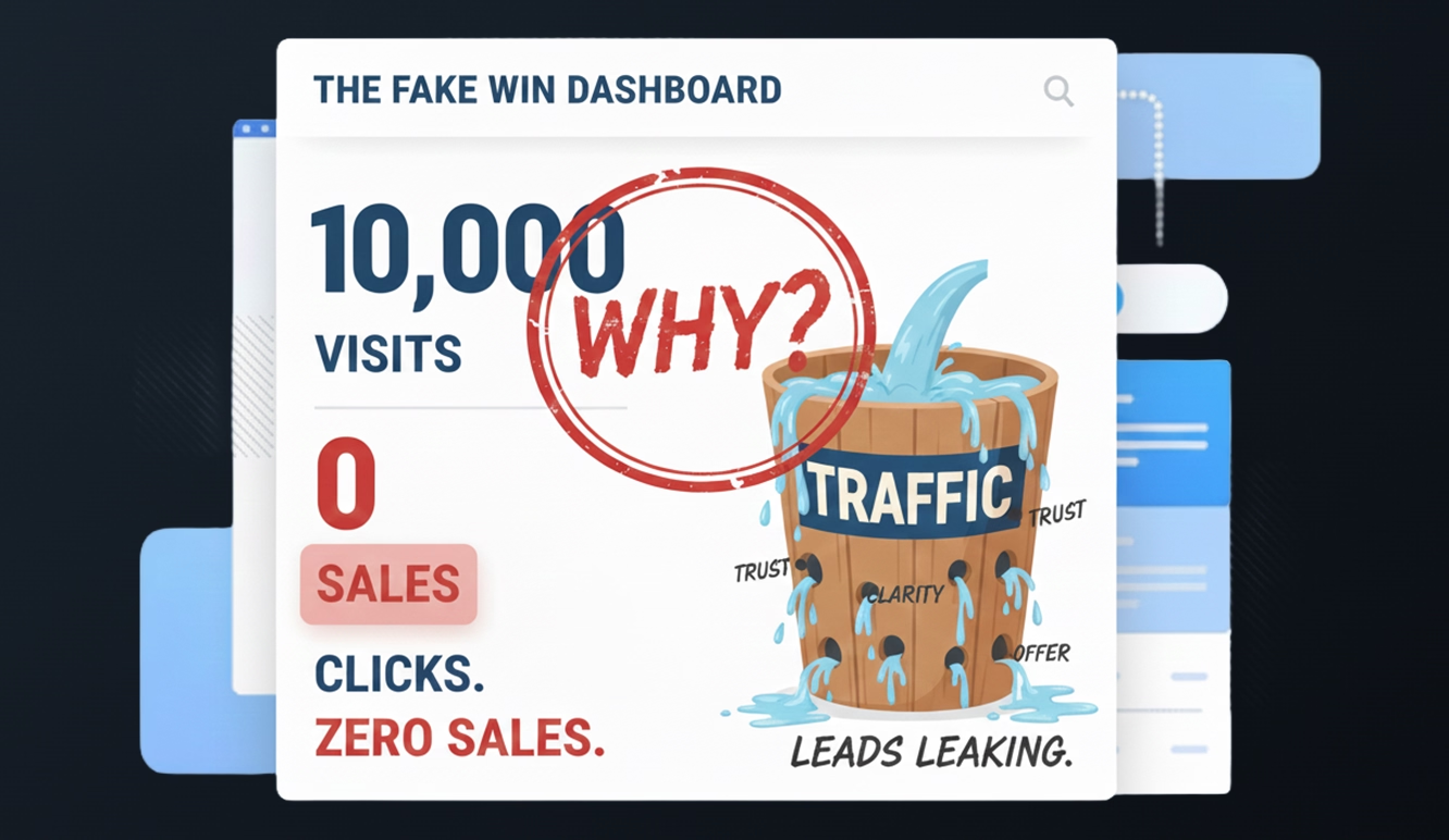
You open your analytics dashboard.
Traffic is up.
Clicks are coming in.
CTR looks healthy.
And sales?
Flat.
No purchases.
No inquiries.
No booked calls.
This is one of the most frustrating problems in digital marketing, and also one of the most misunderstood.
Here is the uncomfortable truth: high traffic with no conversions is a signal, not a failure. It means people are interested enough to look, but not convinced enough to act.
Let’s break down exactly why this happens, what most businesses get wrong, and how to fix it without wasting more money on ads.
First, a Reality Check: Traffic ≠ Buyers
A common assumption is:
“If more people see my site, sales will naturally increase.”
That assumption is false.
Traffic only tells you one thing: people were curious enough to click.
Conversion tells you everything else.
Most websites suffering from “lots of visitors, no sales” are dealing with one or more of these core issues:
- Wrong audience intent
- Weak first impression
- Lack of trust
- Too many choices
- Poor decision guidance
- Misaligned messaging between ads and pages
Notice what’s missing from that list.
Design trends.
New ad platforms.
More traffic.
Let’s start where the real problems live.
1. You Are Attracting Viewers, Not Buyers
This is the most common root cause.
Many ad campaigns are optimized for clicks or engagement, not conversions. Platforms like Meta are extremely good at finding people who like to look, scroll, and tap, even if they never buy anything.
Cheap clicks feel good.
High CTR looks impressive.
Sales stay at zero.
Why?
Because curiosity traffic behaves very differently from purchase-intent traffic.
How to spot this problem
- High traffic, low time on page
- Shallow scroll depth
- Few return visits
- Almost no add-to-cart or form interactions
How to fix it
- Optimize campaigns for purchase, lead, or add-to-cart events, not clicks.
- Accept fewer visits in exchange for higher intent.
- Segment audiences based on behavior, not interest alone.
Less traffic.
More signal.
Better outcomes.
2. Your Ad Promise and Landing Page Don’t Match
This kills trust instantly.
Someone clicks an ad expecting one thing.
They land on a page delivering something else.
Even small inconsistencies create friction:
- “50% off” vs “Up to 50% off”
- One product shown in ads, multiple products on landing
- Premium tone in ads, generic homepage experience
The brain flags this as risk.
And when risk rises, conversion dies.
Fix it
- Build dedicated landing pages for campaigns.
- Mirror headline language exactly.
- Remove distractions, menus, and competing CTAs.
- One promise. One page. One action.
Clarity beats creativity every time.
3. Your First Impression Lacks Trust Signals
People don’t buy because they are unsure, not because they are unconvinced.
Trust is formed in seconds.
If your site feels unclear, dark without reassurance, or unfamiliar, people hesitate.
This is especially true for:
- Premium products
- New brands
- First-time buyers
What trust actually looks like
- Clear value explanation above the fold
- Social proof that feels real, not polished
- Transparent pricing and policies
- Visual safety cues at checkout
A beautiful site without trust cues is still a risky site.
4. Cognitive Overload Is Quietly Killing Your Conversions
This one hurts premium brands the most.
More options feel helpful.
They are not.
When people face too many choices, they don’t choose better, they choose nothing.
On mobile, this effect is amplified.
Imagine landing on a page with:
- 8 product variants
- Multiple sizes
- Multiple materials
- Dropdown menus everywhere
- No guidance on what to pick
The brain stalls.
Not because the product is bad.
Because deciding feels like work.
A proven fix
- Reduce visible options to your top 3 to 5 sellers.
- Group products by use case, not features.
- Hide complexity behind a “browse full collection” link.
- Replace dropdowns with visual selectors.
- Add decision-support microcopy like:
- “Most customers choose this”
- “Best for beginners”
- “Our most popular option”
Clarity converts better than completeness.
5. You Haven’t Justified the Price Fast Enough
If you sell mid- to high-end products, price resistance is not about cost.
It’s about understanding.
People need to know, instantly, why something costs what it costs.
If that explanation is missing or buried, hesitation follows.
What works
- A short “Why it costs this much” section near the top
- Side-by-side comparisons with cheaper alternatives
- Real-world usage context
- Breakdown of materials, process, or expertise
You are not selling a price.
You are selling a reason.
6. Your Visuals Undermine Confidence
Visuals do more than show products.
They signal legitimacy.
Low-quality images, inconsistent styles, or generic stock photos subconsciously suggest risk.
People may not articulate it, but they feel it.
Improve conversion by:
- Showing products in real-world use
- Including scale references
- Using consistent lighting and backgrounds
- Adding short demonstration videos
- Avoiding over-produced visuals that feel fake
Authenticity builds confidence faster than polish.
7. Your Site Is Optimized for Browsing, Not Buying
Many sites look good but fail at the mechanics of conversion.
Common friction points:
- Unclear CTAs
- Hidden contact information
- Too many navigation links
- Long paths to checkout
- Missing reassurance at decision points
Every extra step adds friction.
Every extra decision increases doubt.
Quick wins
- Limit navigation to 3 core items.
- Place your primary CTA where people stop scrolling.
- Repeat CTAs with contextual reassurance.
- Make contact and support visible at all times.
If buying feels hard, people leave.
8. You Are Missing Social Proof Where It Matters
Reviews buried at the bottom of a page don’t help.
Social proof needs to appear before hesitation kicks in.
And it needs to feel specific.
Generic testimonials don’t move decisions.
Strong social proof includes:
- Use-case-based reviews
- Photos or videos from real customers
- Case studies showing outcomes
- Simple credibility markers, not hype
People trust people who look like them.
9. Your Checkout Experience Feels Risky or Unclear
Many conversions die at checkout.
Reasons include:
- Surprise fees
- Limited payment options
- Unclear returns policy
- Lack of security cues
Even small uncertainties trigger abandonment.
Fixes that work
- Show full costs early
- Offer multiple payment methods
- Clearly state return policies near CTAs
- Reinforce security visually at checkout
Confidence closes deals.
10. You Are Trying to Fix Ads Instead of Fixing the Site
This is the biggest strategic mistake.
If your site does not convert, more traffic only magnifies the problem.
Before touching ads:
- Watch session recordings using tools like Hotjar or Microsoft Clarity.
- Run 5-second tests with real people.
- Identify where hesitation appears.
- Simplify before scaling.
Conversion is a system, not a tweak.
Where Sales Rules Fit In (Without the Hype)
Sales “rules” exist to reduce friction, not to manipulate.
When used properly, they reinforce clarity.
- The 3-3-3 rule emphasizes consistency and follow-up.
- The 10-3-1 rule focuses on attention, engagement, and action.
- The golden rule of sales is simple: reduce risk, increase confidence.
All of them point to the same conclusion.
People buy when it feels easy, safe, and obvious.
Final Thought: Clarity Beats Cleverness
Most websites don’t fail because they lack information.
They fail because they demand too much thinking.
Your job is not to impress visitors.
It’s to guide them.
When you reduce friction, remove noise, and align intent with experience, conversions follow.
Not slowly.
Not magically.
Predictably.
FAQ
What is the 3-3-3 rule in sales?
The 3-3-3 rule generally refers to following up three times, across three channels, within three days to maintain momentum and reduce drop-off. Its purpose is consistency, not pressure.
Why am I getting clicks but no conversions?
Because your traffic likely has low buying intent, your landing page messaging does not match expectations, or your site lacks clarity, trust, or decision support.
Why are people visiting my website but not buying?
Most often due to lack of trust, cognitive overload, unclear value proposition, or friction in the buying process. Visitors are interested, but something stops them from committing.
What is the 10 3 1 rule in sales?
It typically refers to reaching out within 10 minutes, providing value within 3 interactions, and asking for a decision within 1 clear CTA. The goal is speed, relevance, and clarity.
What is the golden rule of sales?
Reduce perceived risk and increase confidence at every step. When buying feels safe and obvious, people act.
We define clear objectives, map the shortest path to results, and design systems that remove friction at every step. Every decision is justified, measured, and aligned with conversion, not opinion.
We adopt innovations only when they create real leverage. New tools, methods, or technologies earn their place by improving performance, speed, or clarity, never by trend.
We translate business goals into executable digital systems that support growth, intake, and positioning. The strategy is built to compound over time, not to impress in a deck.

